
Table of Contents
As part of this comprehensive project, I completely reimagined the user experience for EcoTracker, a mobile application platform designed for tracking environmental footprints. The challenge was to create an intuitive interface that would motivate users to adopt more sustainable lifestyle practices.
User Research Insights
Conducting deep user research became the foundation of the entire project. Over six weeks, I interviewed 45 potential users, analyzed competitors, and studied current trends in sustainability and environmental awareness.
Primary insights revealed that users felt overwhelmed by the complexity of tracking their environmental impact. Existing solutions were either too technical or insufficiently motivating for long-term engagement. Users expressed frustration with current market offerings but remained passionate about environmental responsibility.
Design is not just what it looks like and feels like. Design is how it works.
The competitive landscape analysis revealed significant gaps in user experience across the sustainability app market. Most applications focused heavily on data collection while ignoring the emotional journey of users trying to make positive environmental changes.
Information Architecture
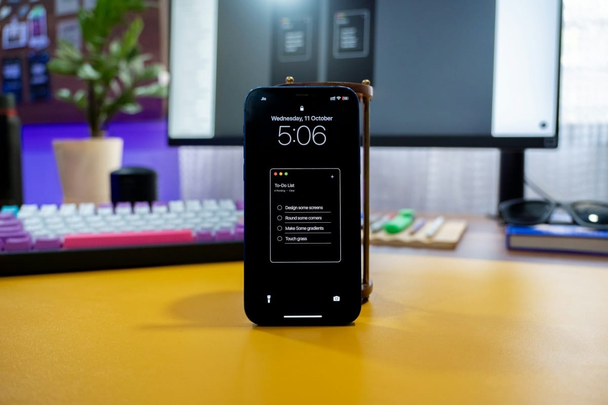
Creating a logical information architecture became critically important for user navigation and feature discovery. I developed a structure that groups functionality into three main categories: tracking, learning, and community engagement.
Optimizing user flows focused on minimizing steps required for key actions while maintaining data accuracy and user engagement. Special attention was paid to the onboarding process and initial profile setup experience.
Critical user flows included carbon footprint logging, joining community challenges, accessing educational content, and sharing achievements. Each flow was mapped, tested, and refined through multiple iterations.
Typography & Color Palette
Creating a cohesive visual design system began with typography selection that would reflect the brand’s friendly and accessible character. I chose a combination of Poppins for headings and Inter for body text, ensuring excellent readability across all device sizes.
The color palette was inspired by natural tones and creates a sense of harmony with the environment. The primary green represents growth and sustainability, while the accent yellow adds energy and optimism. Secondary colors provide flexibility for different content types and interactive states.
.cards {
  display: grid;
  grid-template-columns: repeat(auto-fit, minmax(250px, 1fr));
  gap: 1.5rem;
  padding: 2rem;
}

.card {
  background: #fff;
  border-radius: 12px;
  box-shadow: 0 4px 20px rgba(0,0,0,0.1);
  padding: 1.5rem;
}
Color accessibility was rigorously tested to ensure WCAG AA compliance across all color combinations. The palette supports both light and dark mode implementations, anticipating future product expansion.
Component Library
Developing a comprehensive component library ensured design consistency throughout the application. Each component was carefully considered with various states, interactions, and use cases in mind.
Good design is invisible. It works so naturally that the user doesn’t even think about how they’re interacting with the interface.
The design system includes over 40 unique components, from basic buttons and form elements to complex data visualization widgets. Every component includes detailed specifications for spacing, typography, colors, and behavioral guidelines.
Community Features
User testing was conducted in multiple phases, including moderated sessions, A/B testing of key screens, and unstructured observation of natural user behavior patterns.
Twenty-eight participants from various age groups and technical proficiency levels participated in testing, providing a comprehensive view of the user experience across different demographics. Sessions were recorded and analyzed for both quantitative metrics and qualitative insights.
Testing scenarios covered primary user journeys including onboarding, daily logging, challenge participation, and social interactions. Both lab-based and remote testing methods were employed to capture authentic usage patterns.
Why Onboarding Should Feel Invisible
What I Learned Reviewing Old Work


What are your thoughts?