
Table of Contents
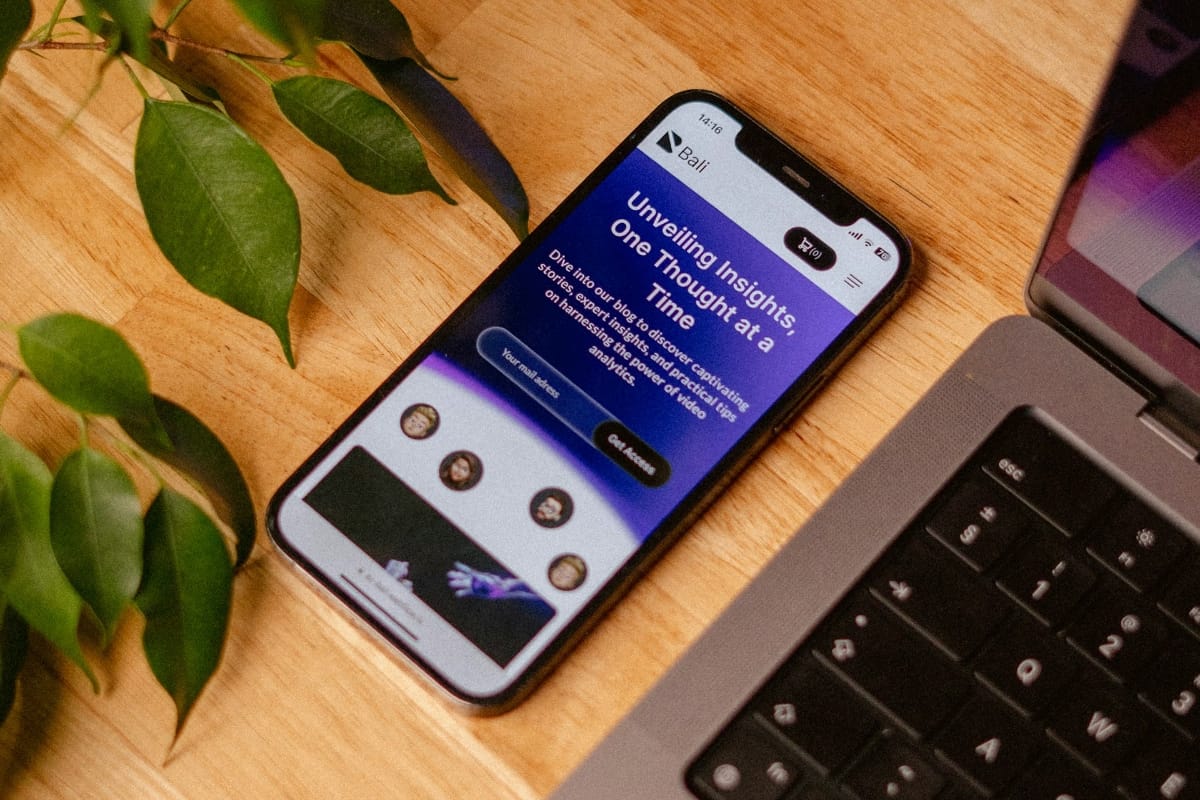
As part of this comprehensive project, I completely reimagined the user experience for EcoTracker, a mobile application platform designed for tracking environmental footprints. The challenge was to create an intuitive interface that would motivate users to adopt more sustainable lifestyle practices.
Primary insights revealed that users felt overwhelmed by the complexity of tracking their environmental impact. Existing solutions were either too technical or insufficiently motivating for long-term engagement. Users expressed frustration with current market offerings but remained passionate about environmental responsibility.
User Research Insights
Conducting deep user research became the foundation of the entire project. Over six weeks, I interviewed 45 potential users, analyzed competitors, and studied current trends in sustainability and environmental awareness.
Progressive prototyping allowed for rapid iteration and early identification of usability issues. The transition from static wireframes to interactive prototypes revealed important insights about user behavior and expectations.
/* Core application color scheme and design tokens */
.dashboard-card {
  background: var(--neutral-light);
  border-radius: var(--border-radius);
  padding: 24px;
  box-shadow: var(--shadow-light);
  transition: var(--transition-smooth);
  border: 1px solid rgba(0,0,0,0.05);
}

.impact-metric {
  display: flex;
  align-items: center;
  gap: 12px;
  padding: 16px;
  background: var(--gradient-primary);
  color: white;
  border-radius: var(--border-radius);
  font-weight: 600;
}
Optimizing user flows focused on minimizing steps required for key actions while maintaining data accuracy and user engagement. Special attention was paid to the onboarding process and initial profile setup experience.
.dashboard-card:hover {
  transform: translateY(-4px);
  box-shadow: var(--shadow-medium);
}
The new user journey allows someone to start tracking their environmental impact in just three simple steps, which is 60% faster compared to the previous version. This improvement significantly reduced drop-off rates during initial app interaction.
Critical user flows included carbon footprint logging, joining community challenges, accessing educational content, and sharing achievements. Each flow was mapped, tested, and refined through multiple iterations.
Typography & Color Palette
Creating a cohesive visual design system began with typography selection that would reflect the brand’s friendly and accessible character. I chose a combination of Poppins for headings and Inter for body text, ensuring excellent readability across all device sizes.
:root {
  --primary-green: #2D5A27;
  --secondary-green: #40A85F;
  --accent-yellow: #F4D03F;
  --accent-blue: #3498DB;
  --neutral-light: #F8F9FA;
  --neutral-medium: #6C757D;
  --neutral-dark: #343A40;
  --success-color: #28A745;
  --warning-color: #FFC107;
  --error-color: #DC3545;
  --gradient-primary: linear-gradient(135deg, #2D5A27 0%, #40A85F 100%);
  --shadow-light: 0 2px 8px rgba(0,0,0,0.1);
  --shadow-medium: 0 4px 16px rgba(0,0,0,0.15);
  --border-radius: 12px;
  --transition-smooth: all 0.3s cubic-bezier(0.4, 0, 0.2, 1);
}
The color palette was inspired by natural tones and creates a sense of harmony with the environment. The primary green represents growth and sustainability, while the accent yellow adds energy and optimism. Secondary colors provide flexibility for different content types and interactive states.
Good design is invisible. It works so naturally that the user doesn’t even think about how they’re interacting with the interface.
Color accessibility was rigorously tested to ensure WCAG AA compliance across all color combinations. The palette supports both light and dark mode implementations, anticipating future product expansion.
Design Process Insights
The iterative design approach and continuous testing with real users helped avoid many potential pitfalls and created a truly user-centered solution. Early and frequent validation saved significant time and resources while ensuring product-market fit.
Cross-functional collaboration proved essential, with regular input from environmental scientists, behavioral psychologists, and sustainability experts enriching the design process and final product effectiveness.
Next phases of product development include expanding social features, integrating with IoT devices for automatic consumption tracking, and adding personalized recommendations based on machine learning algorithms.
Design Thinking methodology as defined by the Stanford d.school and IDEO, emphasizing empathy, ideation, and experimentation in the design process.
Plans also include creating a web version for deeper data analysis and corporate features for organizations pursuing carbon neutrality goals. International expansion is planned with localization for different cultural contexts and environmental regulations.
Advanced features under consideration include AI-powered sustainability coaching, integration with smart home systems, and partnerships with environmental organizations for real-world impact verification.
Responsive design was architected using a mobile-first approach, with progressive enhancement for tablets and desktop environments. Special attention was paid to touch interaction optimization and content readability on smaller screens.


What are your thoughts?