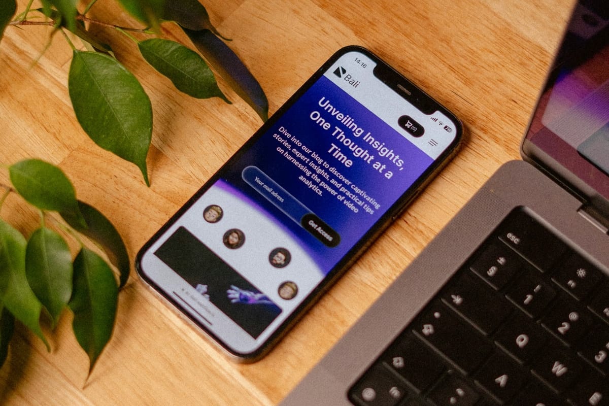
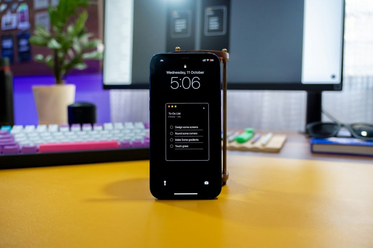


Lessons from a Failed Prototype
In this post, I reflect on a recent design challenge and how I approached it. I walk through my thinking, mistakes, and what I’d do differently next time. Hopefully, it helps others facing similar situations.
Built a scalable design system for a fintech platform, streamlining the transaction dashboard used by over 50,000 users. Prioritized clarity, error states, and secure interactions.
Worked on the full design process for a blogging platform tailored to independent writers. Designed intuitive editing tools and a distraction-free reading experience.
A product redesign that combined user feedback with new design patterns. The challenge was to reduce friction while introducing new features. I led the design from initial wireframes to final handoff.
This project was about turning a messy interface into something people actually enjoy using. I focused on navigation, accessibility, and simplifying decisions for the user. It taught me a lot about balancing usability and personality.
This project focused on simplifying a complex user flow without compromising flexibility. I worked on structure, visual hierarchy, and interaction logic. The result was a cleaner, faster, and more intuitive experience across devices.
A product redesign that combined user feedback with new design patterns. The challenge was to reduce friction while introducing new features. I led the design from initial wireframes to final handoff.
The goal was to create a consistent, scalable UI for a fast-growing platform. I developed a design system and refined several core user flows. Collaboration with engineers played a key role throughout the process.
This project was about turning a messy interface into something people actually enjoy using. I focused on navigation, accessibility, and simplifying decisions for the user. It taught me a lot about balancing usability and personality.


"The incredible attention to detail displayed by this team is commendable. Every aspect of our project, no matter how small, was handled with precision and care. The result is a product that reflects their commitment to excellence."
"Our partnership with this team was characterized by open communication and collaborative efforts. They took the time to understand our goals and delivered a solution that perfectly aligns with our business objectives. Looking forward to future collaborations."
"Working with this creative powerhouse was an enlightening experience. Their brilliance in design thinking and creative solutions brought our project to life in ways we hadn't imagined. The team's passion for innovation is truly infectious."
Data Scientist
Designer
DevOps Engineer
From wireframes to flows, every interaction is designed to be clear, purposeful, and engaging across the entire product lifecycle.
I design clean, modern, and accessible UI systems that not only look good but also enhance usability your brand’s identity.
This helps teams gather feedback early, validate assumptions, and save time and budget down the line.
Through workshops, research, and rapid validation, we turn ambiguity into a clear product direction.
In this post, I reflect on a recent design challenge and how I approached it. I walk through my thinking, mistakes, and what I’d do differently next time. Hopefully, it helps others facing similar situations.
A quick breakdown of how I tackle complex interfaces without overwhelming users. I share a few methods I rely on, plus examples from past projects. Simple tips, real results.
This is a short essay about the role of clarity in product design. I talk about invisible UI, intentional decisions, and how to keep things from getting in the way. Less noise, more function.
I’ve collected a few insights from working with cross-functional teams. This post covers real-life moments where communication made or broke a feature. It’s part reflection, part practical advice.
You've reached the end of the list